I have created some groups in my Icinga (Laptop, Kitchen, Room1, Room2…) when I go “Tactical Overview” I see only Host and Services, are there way to see in that dashboard Laptop, Kitchen, Room1, Room2… and how many hosts its alive or not?
Not sure if I correctly understood what you exactly.
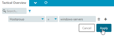
If you want something like the tactical overview, but only showing the hosts from one of your groups (hostgroups I assume?) then you can simply add a filter.
Example:
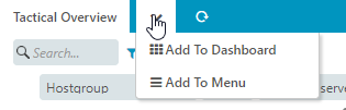
You then can add this new tactical overview to the dashboard or the left-side menu:
You could also go to the Hostgroup menu, set the filters to your wanted groups and then add this to the dashboard or menu via the dropdown:
This should do exactly what you want.
Filter the already existing overview for your hosts, click the dropdown, add it to a dashboard (existing or new one).