Hi,
I have icinga web whit alot of hosts, and now i nedd to change the tipical circle in the dashboard (it shows 2 circles whit hosts and services) for 3 squares whit the stade of the hosts,green square for ok host, yellow esquare for warning host and red square for critical hosts
Is importan this visual change i nedd squares. Is this posible?
ty
Hello there!
Could you maybe provide a screenshot of how it is now?
I’m having trouble imagining it 
EDIT: do you mean the tactical overview with the two donuts?
Maybe it would also help if you made a little mockup of what you would like it to look like!
How much experience do you have with building custom dashboards?
Have a nice day,
Feu
Hello! and thx for ur answer
Actually i have this
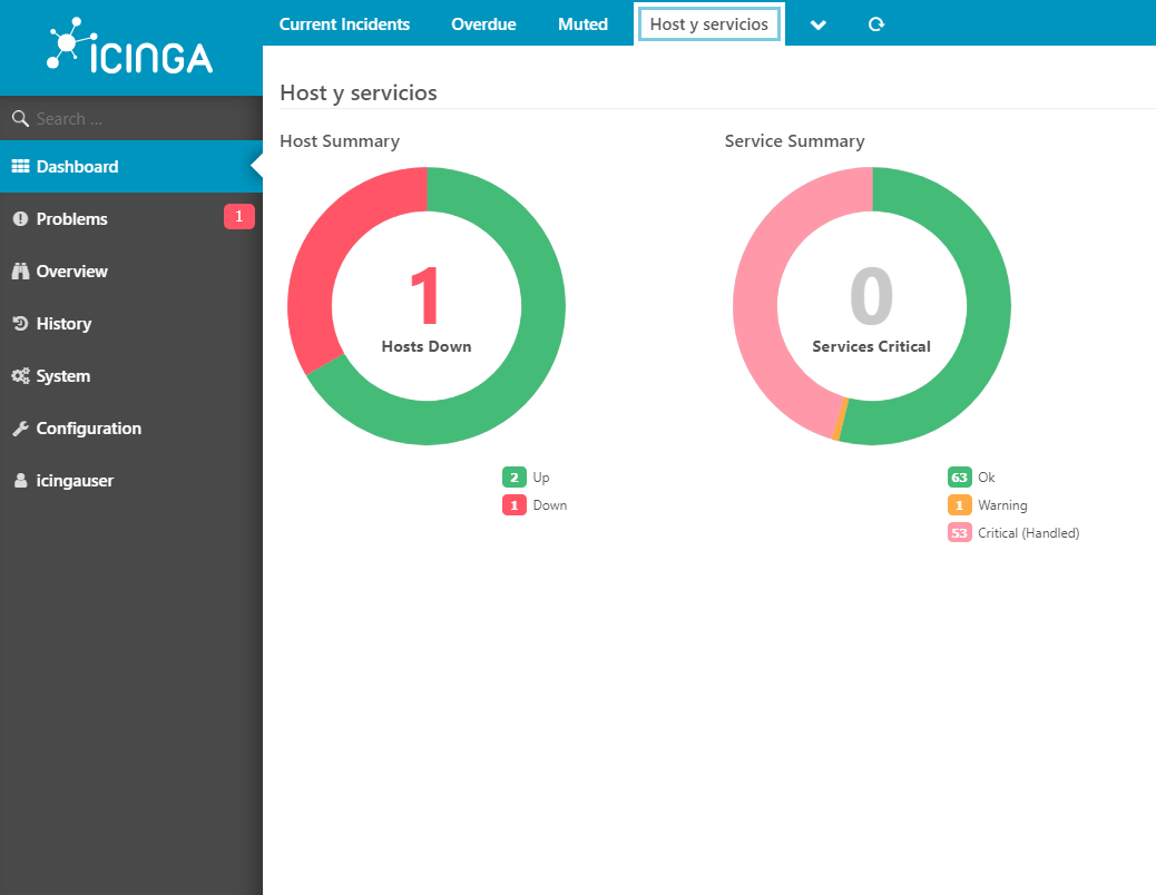
A tipical dashboard whit donuts.
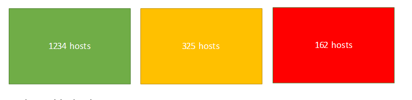
But i nedd change the donuts for a square like this
i thinck the idea its simple, only need change the donut for square.
other questions, is if posible make a dashboard whit the stade of the hots? same as in the second picture.
1 square whit total host critical, 1 whit total host warning and 1 whit total host OK
My experience its 0 jeje , this its a new proyect in my company and i have to do this xD
THX!
Hello again!
Okay, I see now.
Maybe you want to have a look at this dashing solution then?
I think you should be able to piece together what you need with it
Else you can also hop around icinga exchange (the platform dashing is on as well) and browse for other solutions.
Alternatively you could also write your own module for it, if it needs to look exactly like you showed, you can get started over here. It’s just a rough guide, but it might be a fun project to try out!
Have a nice weekend,
Feu