Hi ALL!
given that I don’t know very well GRAFANA and how to build Dashboard.
Anyway I’m using the dashboard published for ICINGA (N° 1572)
This Dashboard automatically create a GRAPH for ALL the Services of a host; ALL the graphs created are of the same Type (Graph).
My question is:
Is possible to change the GRAPH Type for certain Service Checks (using Single Stat or Gauge etc) ?
I thinking of a kind of “IF” condition. IF check is = to THIS, THEN graph type should be THIS…
If this is not possible, as alternative, is possible to HIDE a GRAPH if there is NO DATA or the check itself is NOT present for that HOST?
Regards
you can create your own dashboard for sure. This one uses a loop over all services (can be different amount per host) and displays them. Grafana gives you the freedome to do whatever you want. (I should start tracking what i released, didnt remember i did this one)
Hi!
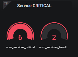
Using the “Icinga” command stats I want to create a “Gauge” that show the Critical Service.
As per my experience This value is obtain from difference of num_services_critical and num_services_handled.
So I have definde 2 QUERIES:
Query A:
SELECT mean(“value”) FROM “icinga” WHERE (“hostname” =~ /^$hostname$/ AND “service” =~ /^$service$/ AND “metric” =~ /num_services_critical/) AND $timeFilter GROUP BY time($__interval), “metric” fill(none)
Query B:
SELECT mean(“value”) FROM “icinga” WHERE (“hostname” =~ /^$hostname$/ AND “service” =~ /^$service$/ AND “metric” =~ /num_services_handled/) AND $timeFilter GROUP BY time($__interval), “metric” fill(none)
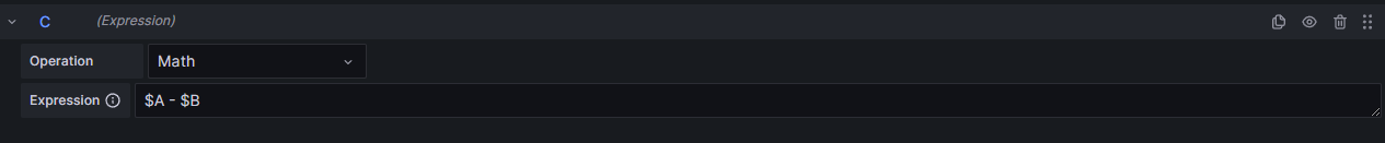
How can I show in my Gouge Panel the difference from value of A and B ?
As you ca see now I have 2 different Gauge. I want to show a single pannel tha show 6-2 = 4